|
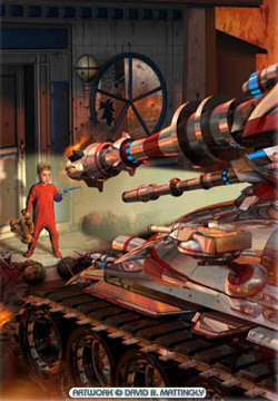
David Mattingly(continued) Interview by Alyce Wilson Getting back to how you work, I noticed that you often use reflections. And how sometimes, in a reflection, you'll show another angle to the scene, show maybe something that is off-camera a bit, out of the field of vision. How do you decide when that's something you want to do in a painting? When you work on a computer and you've built a 3D model, really it's very easy to set it up as reflective. And sort of by default, you have to plan for the rest of the scene. For instance, in that painting called "Road to Damascus", it has a little boy confronting a gigantic tank. I had to prepare everything that was around the tank and set up an environment. It didn't have to be very detailed, but since the tank was reflecting everything on either side of it, you had to tell it what was there. But then just by turning on ray traced reflection, you get this amazing reflective pattern built in. And then I sort of dummied up the scene. I didn't have a model of the little boy. He was actually painted. But I actually took the painting I had done, and I put it on just a square and then set it in front of the tank so I could see where his reflection would actually show up in the tank's reflection field. You did that in 3D Studio Max? I did, yes. Which is a program I like a lot. The other program that a lot of illustrators use is Maya. But from my perspective, it has some disadvantages in that the texture mapping is not as good. And also, polygonal modeling I find much easier to do than handling NURBS. It's much stronger in 3D Studio Max than it is in Maya. Maya's real strength is NURBS modeling. And I remember you saying that, for that reason, you have to go back and forth between a Mac and a PC? I do. If I didn't really love 3D Studio Max, I'd go to all Macintosh Studio. I really prefer the Mac, and PhotoShop works much better on the Mac than it does on the PC. Plus then you have to constantly be updating two computers. But also, when you switch back and forth, the keyboard commands are reversed. So actually, sometimes I'll want to actually have PhotoShop running on both machines. And then I'm constantly getting the keyboard commands wrong. It's a bit of an annoyance. I wish they could just unify the two worlds so you could move it back and forth. Talking about 3D Studio Max reminds me of something that you were talking about yesterday with some of the work that you've been doing with 3D images and then the idea of the moving book cover for ebook versions of things. Where do you see the field of cover illustration going? With the age of digital imagery, what else do you see happening on the horizon? Well, I suspect some sort of animation will occur on ebooks as you go forward. Then the question comes of where would you draw the line? I mean, as you're reading a book, there's the potential for setting an animated sequence. Or, for instance, if you got an ebook of the new Tom Clancy novel, you could also insert a filmed sequence. You could make type dance. You could do all kinds of things. I'm sure people will do innovative things as we go along. To me, it's hard for me to imagine reading a book and having a lot of fancy effects going on as you were trying to read, because it would take away from the reading experience. But just a book cover, if you were trying to select which book you want, a little animation might be sort of an added bonus. And on an ebook, there's no real reason not to do it. How much has the field changed since you started in the '70s? My first cover was in 1978. And it's changed enormously. The illustration business has taken a huge hit because of stock art and digital imaging. For instance, a lot of romance books have gone to photography, have gone to stock art. I think Pino [D'angelico] was the leading romance artist. And this was a guy who had to have been making hundreds of thousands of dollars a year doing romance work. And that market has really tightened up. And then for doing thrillers, where they used to have painted covers, now they'll get a picture from a stock house, and there'll be a nice type solution, and there's been no illustrations involved at all. Also, when I lived in Los Angeles in the middle 1970s, there was a huge market for movie posters. And as you look down the movie posters today, maybe one percent of them are truly illustrated posters. The rest of them are montage photographs. And that was a huge source of income for a lot of guys. There's one particularly talented guy, Drew Struzan, who did the Star Wars movie posters, hundreds of great movie posters. Now he maybe does a couple a year. So, it's an industry that's definitely in transition because of digital imaging and sort of democratizing what the illustrator does, because an art director can now do a lot of what the illustrator does. I mean, from my perspective, they don't do it as well. But all the same, an art director can, a lot of times, come up with their own covers and not have to get the illustrator involved at all. But luckily, I chose science fiction. And science fiction is sort of the last bastion of illustration. I mean, there is stock art out there. I even sell stock art at my web site, and I own the rights to 500 paintings. And I have it all categorized. If people want an alien, they can type in "alien". It will pull up all my covers that have aliens. But then people [who read] science fiction recognize covers, and they're going to say, "Oh, there's the old cover from that Lester Del Rey book, and they put it on this new book. What gives?" Well, today you were saying that, while creatively you probably prefer working on cover art, that you're making more money doing the matte work for commercials? Well, I'm not making more money. It's certainly easier money. If I work a couple of days doing a shot for a production house, I'll make as much money as I do during a cover. And a cover takes me 14, 16, 18 days to do. So you can see I'm getting maybe one-eighth the pay. But I'm certainly much prouder of the book covers. It's a kick when I see a commercial on TV. And you know, look, I made the grass look better. Or I added that building in the background. Or whatever it is. But that's not exactly something five years from now that I'll pull out and say, "Look at this piece of work I did." Now it does happen with the book covers. I'm very proud of what I do. Some of them are good, and some of them are not so good. But it certainly gets my creative juices going, much more than doing production work like that. Well, also, I guess the difference is if you do the work right with matte painting, the viewer doesn't necessarily notice. Yes. It's a rule of thumb that if you saw the movie and you say, "What a great matte shot," it's probably a matte shot that should be cut. So yes, you want it to be invisible. Actually, one of the first shows that had invisible matte shots was the first Star Wars picture, and that was my mentor, Harrison Ellenshaw. And his emphasis always was don't cut back to the shot. Don't draw attention to the fact that it's a matte shot. It should really fit in with the rest of the production's footage. So clearly, that was partially George Lucas's decision, also, but they
got the right guy to execute it. And that was always Harrison's take
on the field.
|