|
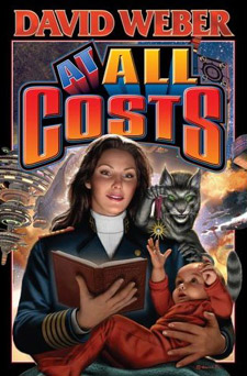
David Mattingly(continued) Interview by Alyce Wilson Could you walk me through the step by step process of how you produce the cover art for, say, an Honor Harrington book? Where do you begin, and how much collaboration do you have with the author/publishing house? Actually, the Honor Harrington books are a bit of an exception, because a lot of times the publishing house doesn't want you to be in contact with the author. And there's a lot of reasons for that. For instance, you could get into a situation where you talk to an author, and the author says, "I know exactly the scene I want." And the scene may or may not be appropriate for selling the book. And if you go back to the company, and they say, "That's not the scene we want," then the author says, "I told the illustrator what I wanted. He didn't do it." So it can really get messy. But in the case of David Weber, he is such an understanding author, and he wants the details right. And the Honor Harrington universe is extremely complicated. I frankly couldn't get it right without his help, especially knowing what ranks people are, what the insignias are. So in general, with David's books, I'll get an outline. His books are so important to Baen Books that they generally start promoting them before he's turned in a finished manuscript. So I'll read it over and try and get a scene that sounds appropriate. And generally, I do three or four sketches. And I'll submit everything... And that's all computer? You know, it's sort of a hybrid. I still sometimes do thumbnail sketches in wash on paper. And then I'll scan them into the computer and then flesh them out. Sometimes it's easier to work in thumbnail size off the computer. And I'll turn them into Jim Baen, and then he'll pick a scene that he likes. And then, generally, he'll send it to David Weber to see if he likes it. But that is an exception, though, because generally, the author really doesn't have anything to say about the cover, for whatever reason. And then David will give me input as to what he sees potentially wrong, like insignias. Actually, his latest book, At All Costs, part of the story is that Honor reads this famous book — that I think was a book David read as a child — to her child. So on the cover, if you look at it carefully, she has a leather-bound copy of this book. I can't remember the author's name. And it has that original cover art embossed into the leather. So it's that sort of detail that hopefully will be rewarding to people if they look at the covers carefully. And it's the sort of detail I might not have gotten without the input of the author. So after you have your idea for your design, what do you do? I look over and see, if there's a human figure on it, I'll need to shoot a model. I don't make figures up out of my head. And there's actually been a bit of a problem on the Honor Harrington thing that the woman I originally used as my Honor Harrington model has gotten older and no longer looks like she did when I shot her. So this time around, I actually needed to hire a new model. So it was sort of a scramble to find someone who looks sort of like the old Honor Harrington that was still quite beautiful. So I then proceed to shoot her with a professional photographer I work with. I don't always. Sometimes I'll shoot the model myself. And then once I have the model shots, I'll take them into PhotoShop and paint over it, rework the model shoot and create the picture. In the instance of the cover for At All Costs, there's a lot of spaceships in the background. And those I've actually pre-built as 3D geometry, and I render those out of 3D Studio Max. And that's essentially the process. It's sort of a process of getting all the pieces together and making it like a unified whole. I remember your saying yesterday that, because you're working in digital format, you do kind of miss the physicality of traditional work. I guess the benefit being you have more flexibility as to how you create the different elements in your work. You do. Working digitally also opens you up to being able to change the painting substantially at a lot of different points along the way. As an instance, if you get done with the painting and you decide, "Gee, I wish I'd made the background look overall yellow," or "I wish I'd made the colors brighter" or less saturated, all of those things can be done globally on a digital file. And you can experiment with it and see if any of these quite radical changes would work or make the piece better. Once you've started work on a traditional media piece, those sort of global changes are extremely difficult to do. You're were telling us yesterday about the matte painter who wouldn't care, and he would just paint things out. Yes, Peter [Ellenshaw] was an almost — I don't even know the word to describe how intuitive a painter he was. And he was also very famous for how quickly he could produce concept sketches. In a concept sketch, you would show an entire scene from a movie. He could complete it in 15 minutes. And they were very rough and very fluid, but you would get an idea what it was going to look like. I'm certainly not capable of working that way. My work is much more plodding in that I have to figure out where something is going to go and really nail down the details. I've noticed that your work is very detailed. How important is this detail, generally speaking, in cover art? It's essentially an element of my style that I don't necessarily have control of. There's an artist named John Harris. He has a book out from Dragon's World called Mass. And this is a guy who put almost no detail in his work. And I adore his work. I certainly wish I could produce work like that. It's just not me. For whatever reason, it's not something I'm capable of doing. It isn't necessarily something I think, you know, "Today I've got to add a whole lot of detail to my work." That's just how it comes out. That reminds me of a question that came to me while looking at your official biography on your web site. You said your influences range from Jim Steranko, whose work is closer to yours in terms of detail and realism. And then Jackson Pollack, who's the ultimate abstract artist. And I was wondering what was it about those two artists that inspired you? Steranko was my childhood idol. And his work just was magical to me. And it still is. I still think he's one of the best artists who's ever worked in comics. And one of the most intelligent artists who's ever worked in the paperback field. And Pollack's work has always appealed to me just because it was so incredibly free. I'm certainly capable of admiring work that doesn't directly form my own style. There's a lot of artists that I can look at and appreciate for what they do and think, "Boy, I wish I could do that." It doesn't necessarily mean I can. But Pollack's work was all about sort of harmonious design without actually going to the point where you need an image. I also really love Pollack's early work when he got into the dripping style. And it was sort of Picasso-esque work with a lot of hidden imagery. Look at some of those paintings. I think one of them is "She-[Wolf]". And you can see words have been written, and then he's gone in and he's obscured the words. And it's almost like an id or a tortured psyche struggling to get out but still wanting to hide parts of his paintings. Would that mean that you like Dali's work? You know, I like Dali's work a lot. We just saw the big retrospective in Philadelphia. We actually came down here to see that. And I was sort of surprised how much I like it. I think as he got older his work got a little bit more of a kitsch aspect to it that was sort of too bad, and Dali sort of became completely consumed with the Dali personality. But that doesn't take away from the middle years of his career, where he produced stuff that was just mind blowing. And he was a great technician, too, you know, those buttery skin tones.
|